Martex - Software, App, SaaS & Startup Landing Pages Pack
Documentation
- Created: 02 / 06 / 2023
- Last Updated: 08 / 06 / 2023
- by: DSAThemes
Welcome! First of all we want to thank you for purchasing our Landing Pages Pack
We really do appreciate every sale. If you like our work please do not forget to rate it. It helps us in
developing new and better items

In the following sections we will explain how to set up and use it the easiest way possible. If you have any questions that you feel should have been in this document you can contact us through our profile page on themeforest.net/user/DSAThemes and we'll get back to you as soon as possible. Thanks so much!!!
For questions on basic HTML, JavaScript or CSS editing - please give your question a quick Google or visit W3Schools as template issues get top priority. You will need some knowledge of HTML/CSS to edit this tempate.
Requirements
Code Editors
You can use notepad++ , sublimetext 3 or brackets for editing the code.
- Notepad++ download link: https://notepad-plus-plus.org/
- Brackets download link: http://brackets.io/
- Sublime Text 3 download link: http://www.sublimetext.com/3
Tips for existing demos
Use Firebug or Chrome Developer Tools.
Do not start from scratch, use an existing page from the demo and modify it to learn how it works.
Quickly find what you are looking for in this document by using your browser's "Find in Page" feature, typically Control + F.
Many times plugins are to blame when a site fails, always try disabling any third-party plugins if you encounter an error you can't solve.
Don't forget to re-explore the live demo for layouts, usage ideas and sample code
Files Structure
Unzip the downloaded files to the local disk on your computer. Inside the extracted folder there will be a folder with documentation and a folder with the html templates.
As Martex is an HTML template, it uses a number of .html pages (27 demo pages + 26 additional inner pages ) in conjunction with css stylesheets and a number of javascript plugins. The following is a brief overview of the files and a look at some prominent features.
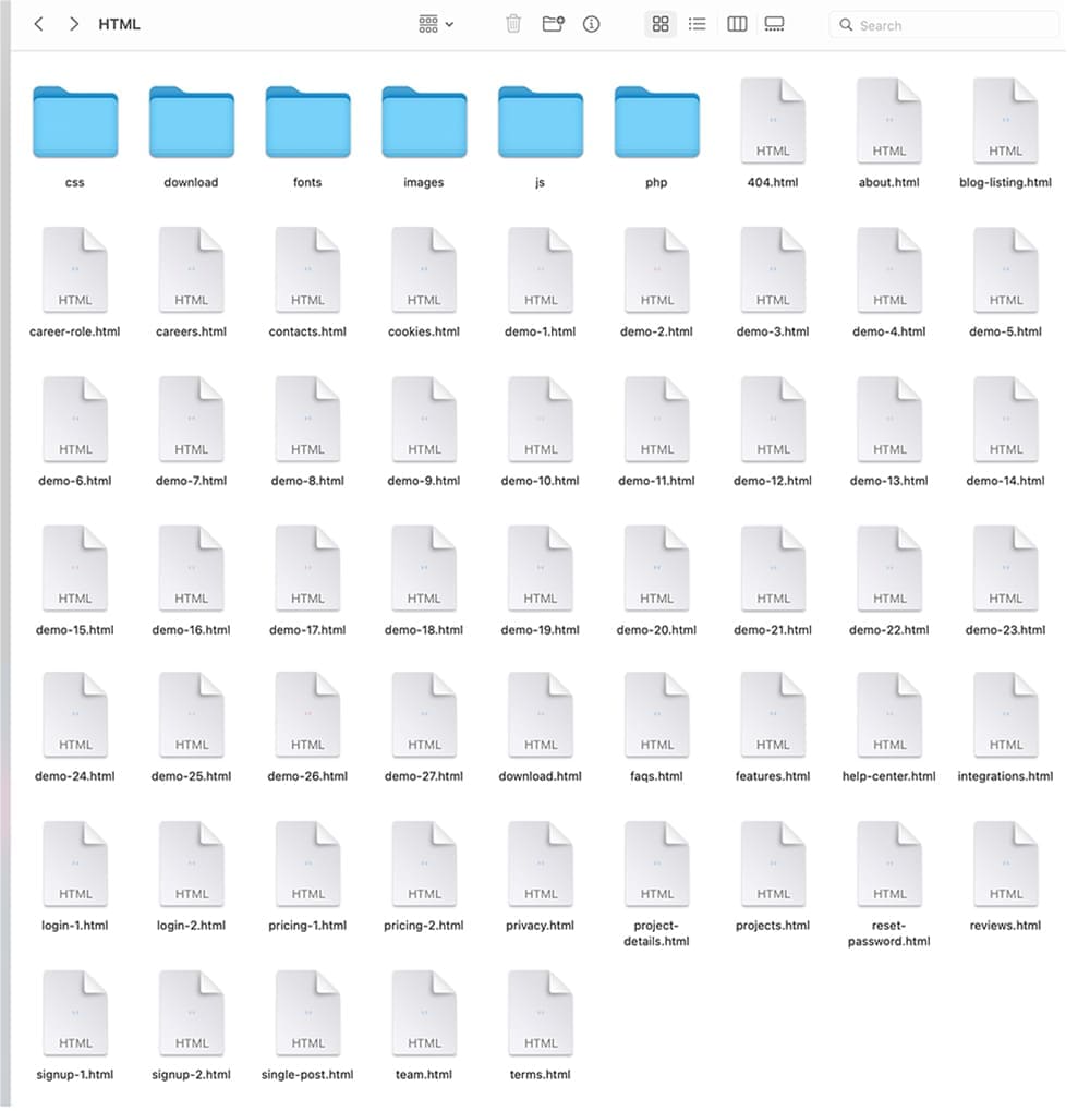
- css ( main CSS file, bootstrap4 CSS files etc. )
- download ( folder for files that user can download from your website )
- fonts ( flaticons )
- images ( all images )
- js ( template js )
- php ( registerForm.php etc. - form PHP files )
- demo-x.html - 27 html files (number of the demos)
Template Installation
Unzip the downloaded files to the local disk on your computer. Inside the extracted folder there will be a folder with documentation and a folder with the html templates. Martex is a HTML template so there's no really "installation" required just unzip the main file you've downloaded from Themeforest and after unziping you have your all template ready to be used.
- Choose the layout and additional inner pages which you will use in project
- Rename a demo-x.html in the index.html
- Make necessary changes (add your text, images etc.)
- Copy all folders and html pages which you will use in project into your www or public_html directory on your server or local computer using FTP client or File Manager (or similar)
HTML Structure
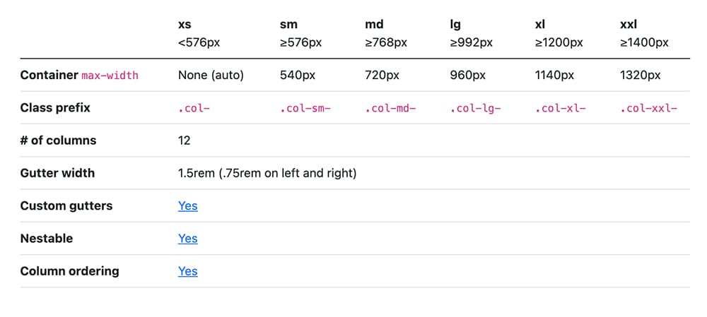
Martex template is based on Bootstrap v5.2.3 - a collection of CSS and JS files that can help you rapidly develop sites that look beautiful at any size, be it a 17" laptop screen or an iPhone.
Bootstrap's base grid is a variation of the grid system. The syntax is simple and it's effective cross browser, but the awesome part is that it also has the flexibility to go mobile like a champ. You can really easily customize all part of site or build new.
Bootstrap’s grid system uses a series of containers, rows, and columns to layout and align content. It’s built with flexbox and is fully responsive.
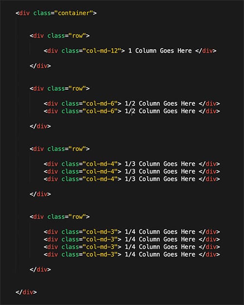
The demo-x.html is the main template file that contains the HTML structure of the template. Here is the general structure (shortened):
HTML Markup
If you need more information, please visit this site: https://getbootstrap.com/docs/5.0/layout/grid/
CSS Structure
All CSS files css files are stored at "css" folder. Here's a list of the stylesheet files we're using with this template. You can find more information opening each file:
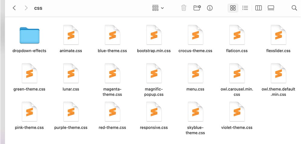
- dropdown-effects - A folder with dropdown-effects for responsive mega menu
- animate.css - A cross-browser library of CSS3 animations
- bootstrap.min.css - This is a main stylesheet that required for basic template styling like form, input, div, list element and etc.
- flaticon.css - A complete set of 200+ thin vector icons
- flexslider.css - An awesome, fully responsive jQuery FlexSlider Plugin v2.0
- lunar.css - Beautifully designed Bootstrap modals
- magnific-popup.css - A responsive lightbox stylesheet
- menu.css - A css file for responsive mega menu
- owl.carousel.css - A responsive carousel slider
- owl.theme.default.min.css - A responsive carousel slider customization file ( it is required if you'd like the default nav controls like dots or next buttons)
- responsive.css - This stylesheet contains responsive rules for adapting the template to any resolution, from desktop to small mobile.
- style.css - The main CSS file contains some general styling, such as anchor tag colors, font-sizes, etc.
Color scheme css files:
- blue-theme.css - The main CSS file for blue color scheme (contains some general styling, such as anchor tag colors, font-sizes, etc.)
- crocus-theme.css - The main CSS file for crocus color scheme (contains some general styling, such as anchor tag colors, font-sizes, etc.)
- green-theme.css - The main CSS file for green color scheme (contains some general styling, such as anchor tag colors, font-sizes, etc.)
- magenta-theme.css - The main CSS file for magenta color scheme (contains some general styling, such as anchor tag colors, font-sizes, etc.)
- pink-theme.css - The main CSS file for pink color scheme (contains some general styling, such as anchor tag colors, font-sizes, etc.)
- purple-theme.css - The main CSS file for purple color scheme (contains some general styling, such as anchor tag colors, font-sizes, etc.)
- red-theme.css - The main CSS file for red color scheme (contains some general styling, such as anchor tag colors, font-sizes, etc.)
- skyblue-theme.css - The main CSS file for red skyblue scheme (contains some general styling, such as anchor tag colors, font-sizes, etc.)
- violet-theme.css - The main CSS file for red violet scheme (contains some general styling, such as anchor tag colors, font-sizes, etc.)
If you create you own styles you must check all the sizes of responsive so all works OK, if you need to change your own styles at certain size you will do it at responsive.css
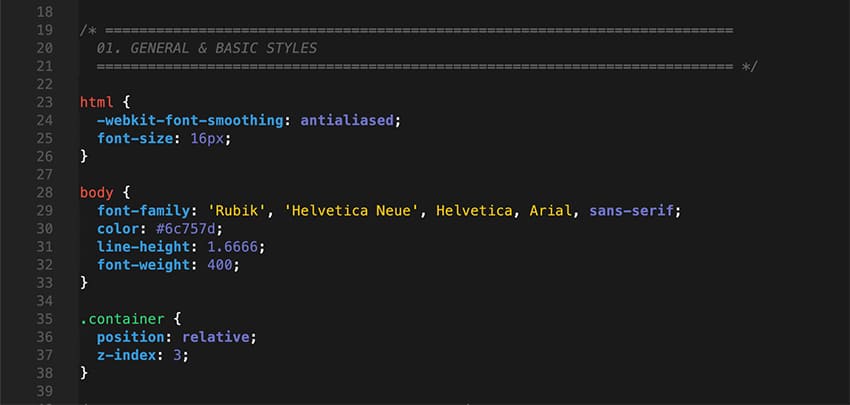
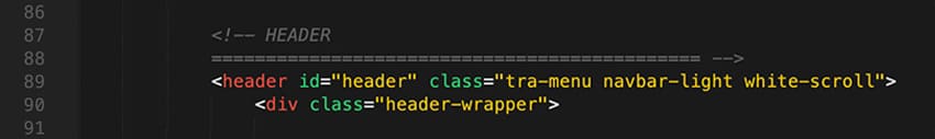
Every section of the style.css file is commented, so we believe you will have no problem editing it. For example, comment that marks begin of the header wrap section looks like this:
How to edit styles
If you would like to edit a specific section of the site, simply find the appropriate label in the CSS file, and then scroll down until you find the appropriate style that needs to be edited. For example if you would like to edit the background color, open up the style.css file and do the following:
If you find that your new style is not overriding, it is most likely because of a specificity problem. Scroll down in your *.css file and make sure that there isn't a similar style that has more weight.
Javascript
This template uses several scripts many of which are documented within the template's code. If you're a developer, you will find this particularly useful. Here are the included Javascript files:
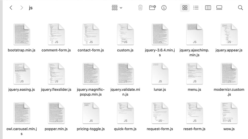
- bootstrap.min.js - This framework provides additional user-interface elements such as dialog boxes, tooltips, carousels etc.
- comment-form.js - A jQuery plugin for comment form
- contact-form.js - A jQuery plugin for contact form
- custom.js - This file contains the general jQuery setups for the scrollup plugin, contact form validation and more.
- jquery-3.6.4.min.js - Is a Javascript library that greatly reduces the amount of code that you must write.
- jquery.ajaxchimp.min.js - jQuery plugin for MailChimp subscribe form
- jquery.appear.js - jQuery plugin for tracking element's appearance in browser viewport
- jquery.easing.js - A jQuery plugin to give advanced easing options.
- jquery.flexslider.js - This is jQuery plugin which adds a fully responsive slider to your pages
- jquery.magnific-popup.min.js - Magnific Popup is a responsive lightbox & dialog script
- jquery.validate.min.js - jQuery form validation plugin
- lunar.js - jQuery plugin for beautifully designed Bootstrap modals
- menu.js - A jQuery plugin for responsive mega menu
- modernizr.custom.js - Is a JavaScript library that detects HTML5 and CSS3 features in the user’s browser.
- owl.carousel.js - A responsive carousel slider jQuery plugin
- popper.min.js - A library to manage your poppers
- pricing-toggle.js - A JavaScript code for pricing plans switching
- quick-form.js - A jQuery plugin for quick form
- request-form.js - A jQuery plugin for request form
- reset-form.js - A jQuery plugin for reset form
- wow.js - A jQuery plugin for reveal CSS animation as you scroll down a page
Customizations & Styles
Select your desired layout and make the following changes.
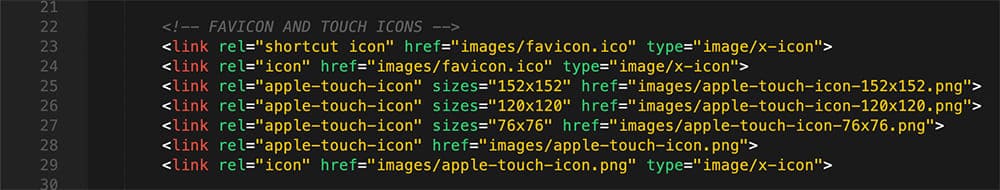
Changing Favicon:
The favicon is located in the /images/ - favicon.ico. You don't have to make any changes on the HTML, just replace the icon file with yours. Please be sure to force refresh your browser's cache in order to see the new favicon.
You can easily generate your favicon here: Favicon & App Icon Generator
Don't forget to replace icons for IOS devices - apple-touch-icon-152x152.png , apple-touch-icon-120x120.png, apple-touch-icon-76x76.png and apple-touch-icon.png. These icons are also located in the /images folder
Changing Fonts:
Martex uses one font "Rubik" Google WebFont for text and headers. To change the embedded fonts, please take a look in the head part of the website and you will find this tag:
Martex uses Rubik fonts for text and Plus+Jakarta+Sans for headers. To change the embedded fonts, please take a look in the head part of the website and you will find this tag:

To change the font, first go to http://www.google.com/fonts/ choose a font and use the generated code..
Choosing Template Layout:
Martex HTML Template includes 27 different template layouts and 20 additional inner pages :
- Choose the layout and additional inner pages which you will use in project
- Rename a demo-x.html in the index.html
- Make necessary changes (add your text, images etc.)
- Copy all folders and html pages which you will use in project into your www or public_html directory on your server or local computer using FTP client or File Manager (or similar)
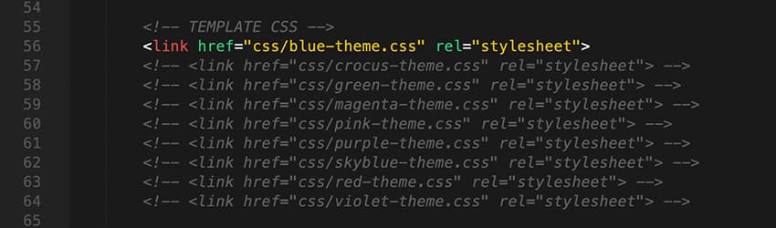
Choosing Color Scheme:
Martex HTML template includes 9 color schemes. Inside the css folder there are 9 css files for diferent color schemes. You can use one of predefinied colors or build custom CSS with color which you want.
It's easy to change color scheme of this template, you just need to do following:
- Open the demo-x.html file.
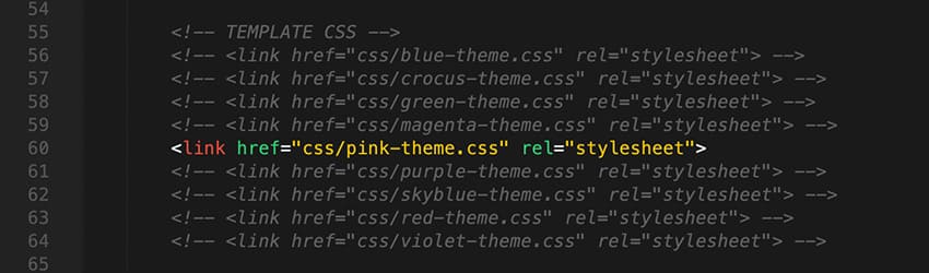
- Find these lines of code in <head> section (blue-color scheme set as default!!):
- Choose your favorite color (for example you want to change the blue-color scheme to the pink) with remove one of the comment tag like this:
- Save and see the result!
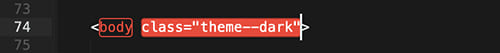
Light and Dark Mode:
To switch the dark mode just add the class theme--dark to the body tag:
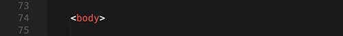
The Light Mode is set as default:
To set the Dark Mode:
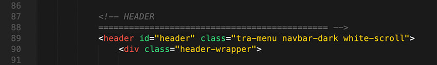
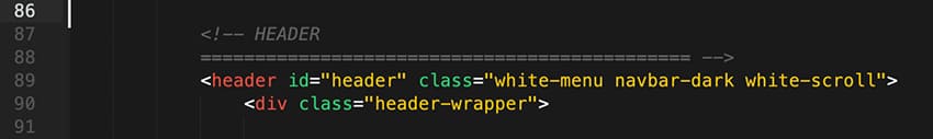
Header Customization
Background Color:
- tra-menu - transparent background header
- white-menu - white color background header
Navigtion Menu Text Color:
- navbar-dark - black color text
- navbar-light - white color text
HTML Markup:
Here are some representative examples of these classes:
The header has transparent background color and black color for text
The header has white background color and black color for text
The header has transparent background color and white color for text
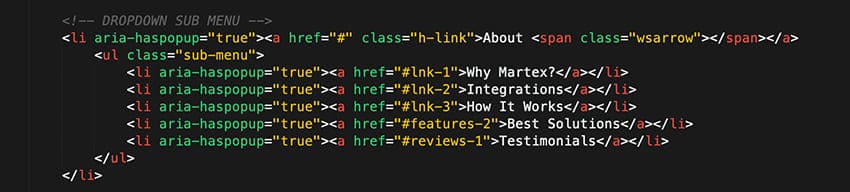
Navigation Menu: Scrolling to a spot :
Scrolling to a spot in an HTML page is pretty simple to do. You have a lot of IDs on the page to scroll to. Write your anchor tags just as you normally would with the href attribute pointed at the ID you would like to move to (e.g. href="#lnk-1".) This means that if JavaScript is turned off, your menu will continue to function normally.
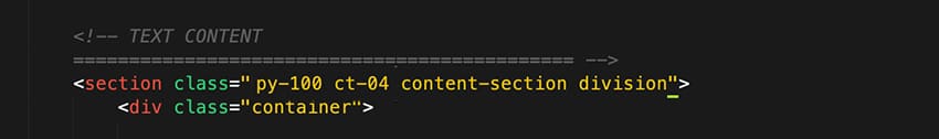
Margin and Padding for Sections and Content
Martex includes a wide range of shorthand responsive margin and padding classes to modify an element’s appearance.
The classes are named using the format: {property}{sides}-{size}
Where property is one of:
- m - for classes that set margin
- p - for classes that set padding
Where sides is one of:
- py - for classes that set padding-top and padding-bottom
- t - for classes that set margin-top or padding-top
- b - for classes that set margin-bottom or padding-bottom
- l - for classes that set margin-left or padding-left
- r - for classes that set margin-right or padding-right
Where size is value in the pixels (multiple of 10) - 10, 20, 30, 40, 50 etc.
HTML Markup:
Here are some representative examples of these classes:
The section has the padding top and bottom 100px

The section has only the padding top 100px

The section has only the padding bottom 100px
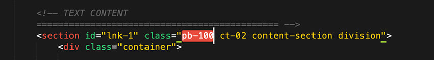
- py-100 - that class sets up the the padding top 100px and padding bottom 100px
- py-90 - that class sets up the the padding top 100px and padding bottom 90px
- py-80 - that class sets up the the padding top 100px and padding bottom 80px
- py-70 - that class sets up the the padding top 100px and padding bottom 70px
- py-60 - that class sets up the the padding top 100px and padding bottom 60px
- py-50 - that class sets up the the padding top 100px and padding bottom 50px
- py-40 - that class sets up the the padding top 100px and padding bottom 40px
- etc.
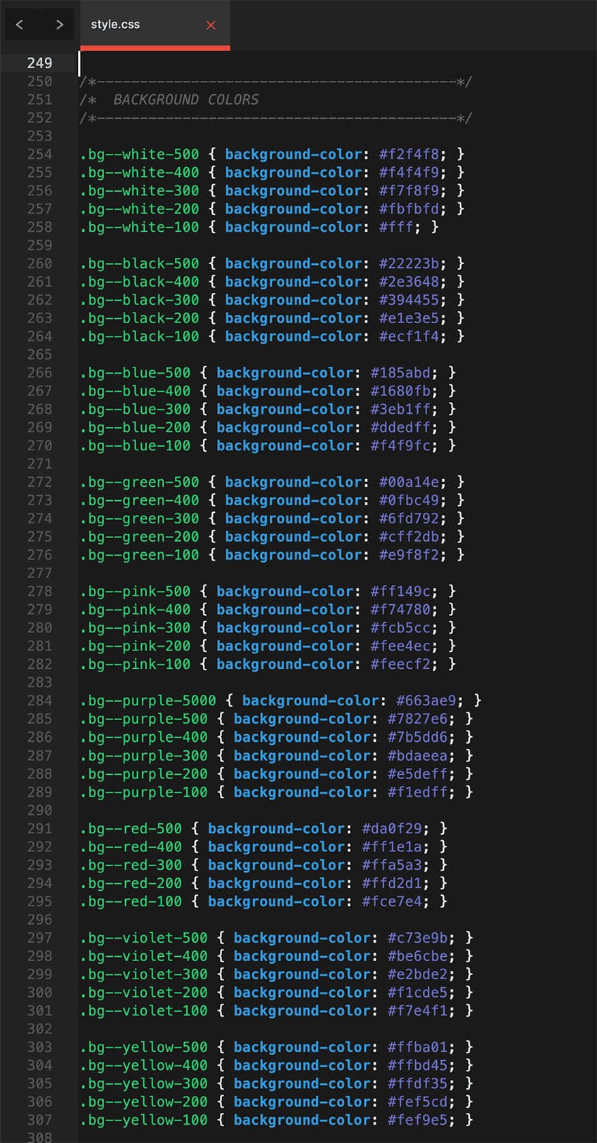
Background color for section:
Most of the sections don't have background color. But if you want you can change the background color manually:
- Open the demo-x.html file in your text editor (I use Sublime Text (http://www.sublimetext.com/3) .
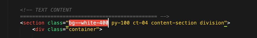
- Find the section you want to change the background color (for example reviews-1):
- Select the background color you want to apply:
- Add the class of the background color to the section (for example you want to change white background color to the light grey color, so you can add the class bg--white-400 to the section)
- Save and see the result!
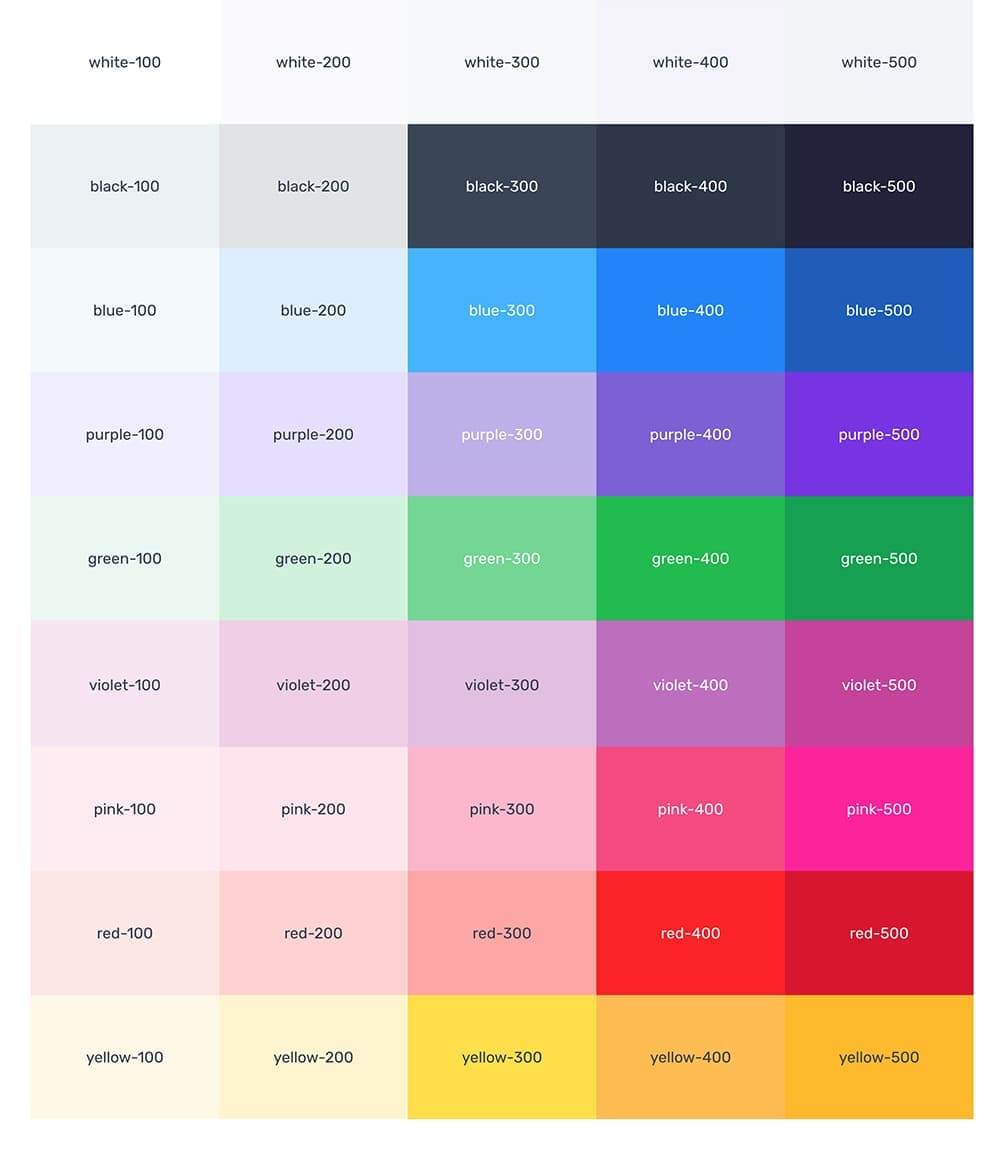
All available colors for background:
Button Color:
Similar to the background color classes, set the color of a button. To change the color of the button manually:
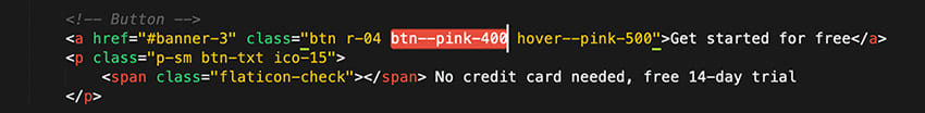
- Open the demo-x.html file in your text editor (I use Sublime Text (http://www.sublimetext.com/3) .
- Find the button you want to change:
- Select the background color you want to apply:
- Change the class of the background color (for example you want to change blue background color to the pink, so you must add the class btn--pink-400 instead of btn-blue-400):
- Save and see the result!

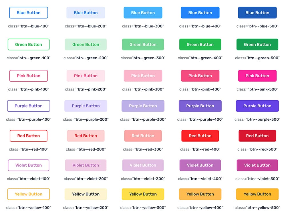
All available classes for button colors
Lightbox Customization
The lightbox is driven by the Magnific Popup jQuery plugin. Magnific Popup is a responsive lightbox & dialog script with focus on performance and providing best experience for user with any device.
HTML Markup:
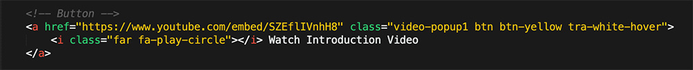
It is very easy to customize just add suitable class video-popup1, video-popup2 or video-popup2 to the link you want Magnific Popup to be enabled on and video link into the tag a
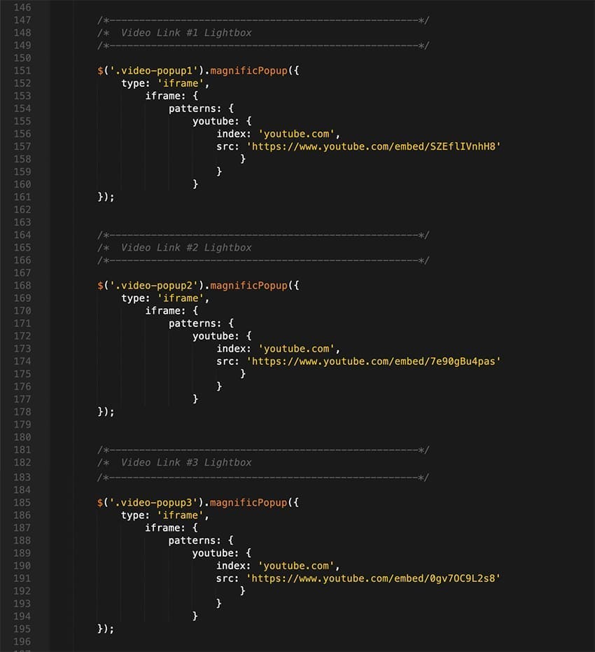
Initializing popup
Popup initialization code is situated in the custom.js file. There are 3 ways for video (class="video-popup1, video-popup2 or video-popup2") to initialize a popup (in this place you need only enter your video link):
For more information visit their website and check the documentation
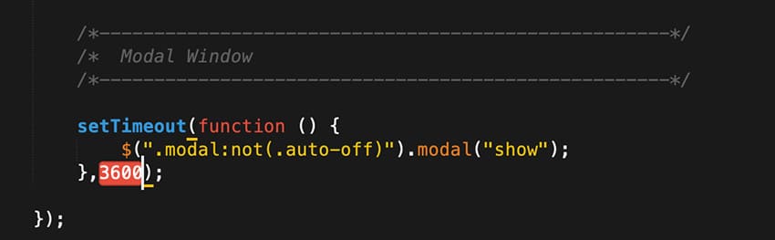
Modal Window Customization:
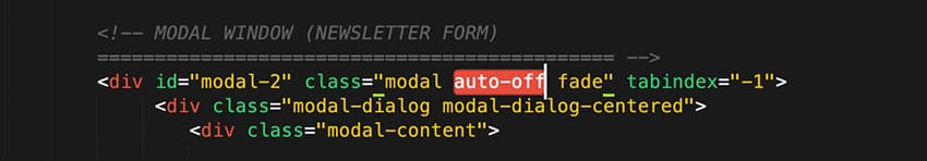
To deactivate your content as a pop-up just add the class auto-off
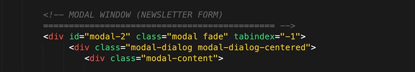
To activate your content as a pop-up just remove the class auto-off
To setup the pop-up appear interval open the file js/custom.js, find the code for modal and setup the interval manually
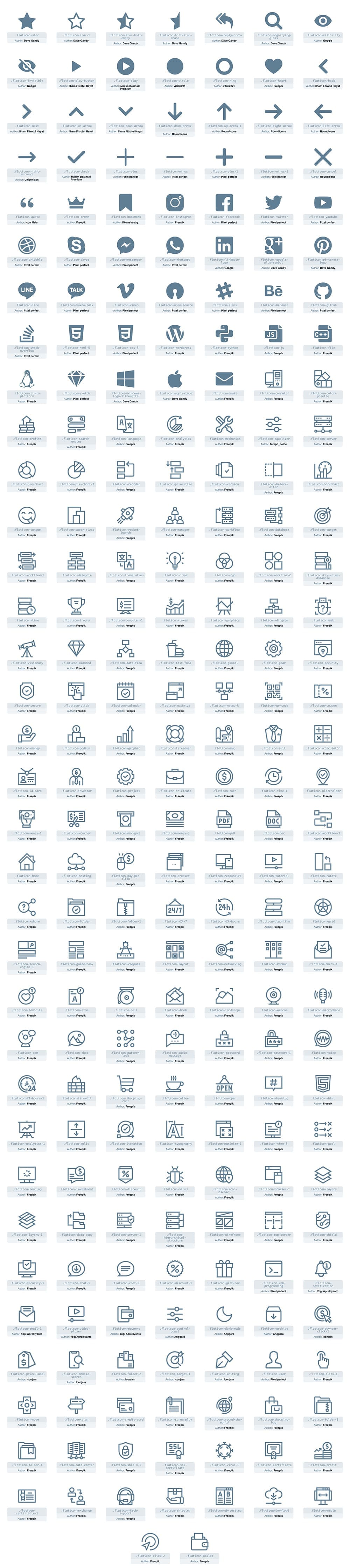
Icons Pack
Martex uses Flaticons Pack (250+ Icons)
HTML Markup for FlatIcons:
Flaticons icons use the 'span' element and each have their own unique class. For a full list of available classes, see here
Forms
Mailchimp Subscribe Form
If you want to use the newsletter you need to have a MailChimp account (the funcional Newsletter works only with MailChimp - http://mailchimp.com/).
Open the custom.js file in your code editor, changes needs to be made here :
http://xxx.xxx.list-manage.com/subscribe/post?u=xxx&id=xxx
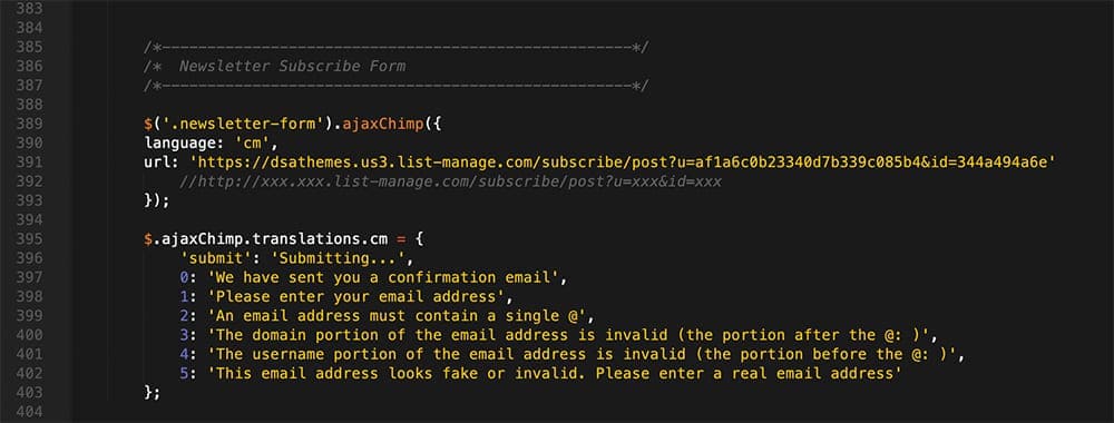
You need to change three value
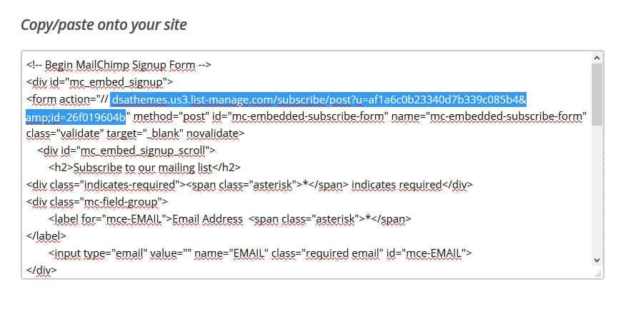
xxx.xxx.How to find mailchimp form action URL?
Just go to your mailchimp account. Then your list. Then Signup forms. Select Embedded forms. You will find form action URL in this page.
Here you'll learn how to add an embedded form to your site, and which third-party sites accept MailChimp Add an embedded form to your website
One notice: this will be functional only on your server, php file can not be executed on your local computer.
Contact Form / Comment Form / Quick / Request / Reset Form:
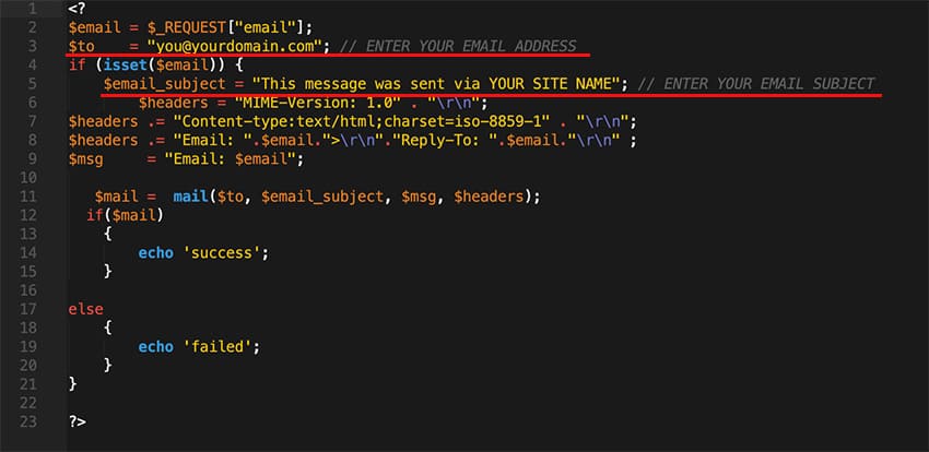
Martex also uses the PHP engine for activate contact process. The message direct send to your email address, so you can edit your email address in php/contactForm.php, php/commentForm.php, php/quickForm.php, php/requestForm.php or php/resetForm.php file.
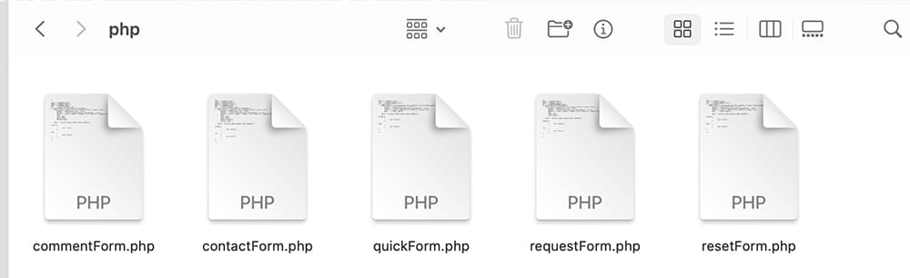
This will not be available for anyone to see, it is only used by the server to send your email. You can also specify an email subject line (or just leave the one which is there). To do this, please open php/contactForm.php, php/commentForm.php, php/quickForm.php, php/requestForm.php or php/resetForm.php file and change these lines:
One notice: this will be functional only on your server, php file can not be executed on your local computer.
File Names: contactForm.php, quickForm or commentForm (you must use these file names exactly)
Sources & Credits
Fonts:
Google Fonts - http://www.google.com/webfonts
Icons Font-face - http://fortawesome.github.com/Font-Awesome/
Scripts:
-
Bootstrap 5.x Framework - hhttps://getbootstrap.com/
-
jQuery - http://www.jquery.com/
-
Vector Icons - https://www.flaticon.com/
-
High-quality photos, vectors, videos, and mockups - https://www.freepik.com/
-
Form Validation - http://bassistance.de/jquery-plugins/jquery-plugin-validation/
Support
Support includes bugs fixing, and general problem solving with features explained on the template’s official sales page.
Support does not include:
- solving problems for plugins not packaged with our framework and templates;
- plugins integration;
- adding new features or extending the features currently available;
- any type of modification or customization.
Once again, thank you so much for purchasing this template. As I said at the beginning, I'd be glad to help you if you have any questions relating to this template. No guarantees, but I'll do my best to assist. If you have a more general question relating to the templates on ThemeForest, you might consider visiting the forums and asking your question in the "Item Discussion" section.
Best Regards,
DSAThemes